Donna Vino
e-commerce:
UX system, Team Flows, and product delivery


PROJECT INTRODUCTION
PROBLEM STATEMENT
Buying quality Italian wine online can be confusing for Danish users, unfamiliar with grape varieties, regions, or pairing suggestions.
The existing platform lacked clear structure, intuitive filtering, and a smooth product discovery experience, leading to user frustration and high drop-off rates.
PROJECT OBJECTIVE
Redesign the e-commerce experience to simplify wine selection, enhance product discoverability, and streamline user flows, making the platform more intuitive and engaging for both wine experts and casual buyers.
DATE:
Feb. 2025 - July 2025
TOOLS:
Figma
Canva
Gifthub
Trello
Discord
ROLE:
UX/UI Designer
Project Manager
UX Coordinator
PHASE 1 – First steps into the project
When I joined the Donna Vino team as a UX Design intern, the e-commerce platform was still at an early stage.
The team already had a rough draft of a design system and a few incomplete screens, but no real UX research had been done yet. There was no defined color palette, typography, spacing, or UI consistency.
Everything felt temporary and disconnected.
At the beginning, I worked under the guidance of the UX Lead, Davide, alongside eight other UX designers.
My first challenge was understanding the design direction and figuring out how to contribute without clear guidelines.
I started by familiarizing myself with the Figma workspace and reviewing what had been done so far.
Then, I began collaborating with the other designers, offering small suggestions to improve layout and visual structure on a few components.
Figma workspace Donna Vino

FOOTER OPTIMIZATION
The original footer was minimal and lacked structure.
I redesigned it to follow common e-commerce conventions, organizing the content into clear columns and adding links to relevant pages.
Even though some of the pages weren’t live yet, including them improved the site's navigability and future SEO performance by using meaningful, searchable anchor text.

Mobile Footer

Web Footer


FILTERS OPTIMIZATION
The filters, which were meant to help users refine their search, were poorly positioned.


Expecially in the Web Layout, when opened, they created an awkward amount of white space, and they weren’t expandable enough.

PHASE 2 – From Ux Designer to Ux coordinator
UX RESEARCH
After a few weeks, I was promoted to UX Coordinator and took on more responsibilities.
One of my first actions in this new role was to organize the first user research activity.
Since our users were selected clients with limited availability, it would have been difficult to schedule interviews with each of them individually.
That’s why I chose to start with an online questionnaire, which we sent via email to the existing customer base.
Although this method gave us mostly quantitative feedback, it allowed us to quickly collect structured insights and identify recurring user needs and pain points.

Extracted visual from the survey:
User sample age distribution
We received valuable insights, especially around buying behaviors, expectations around delivery, and product discovery.
From the answers, I helped the team extract key patterns and pain points.
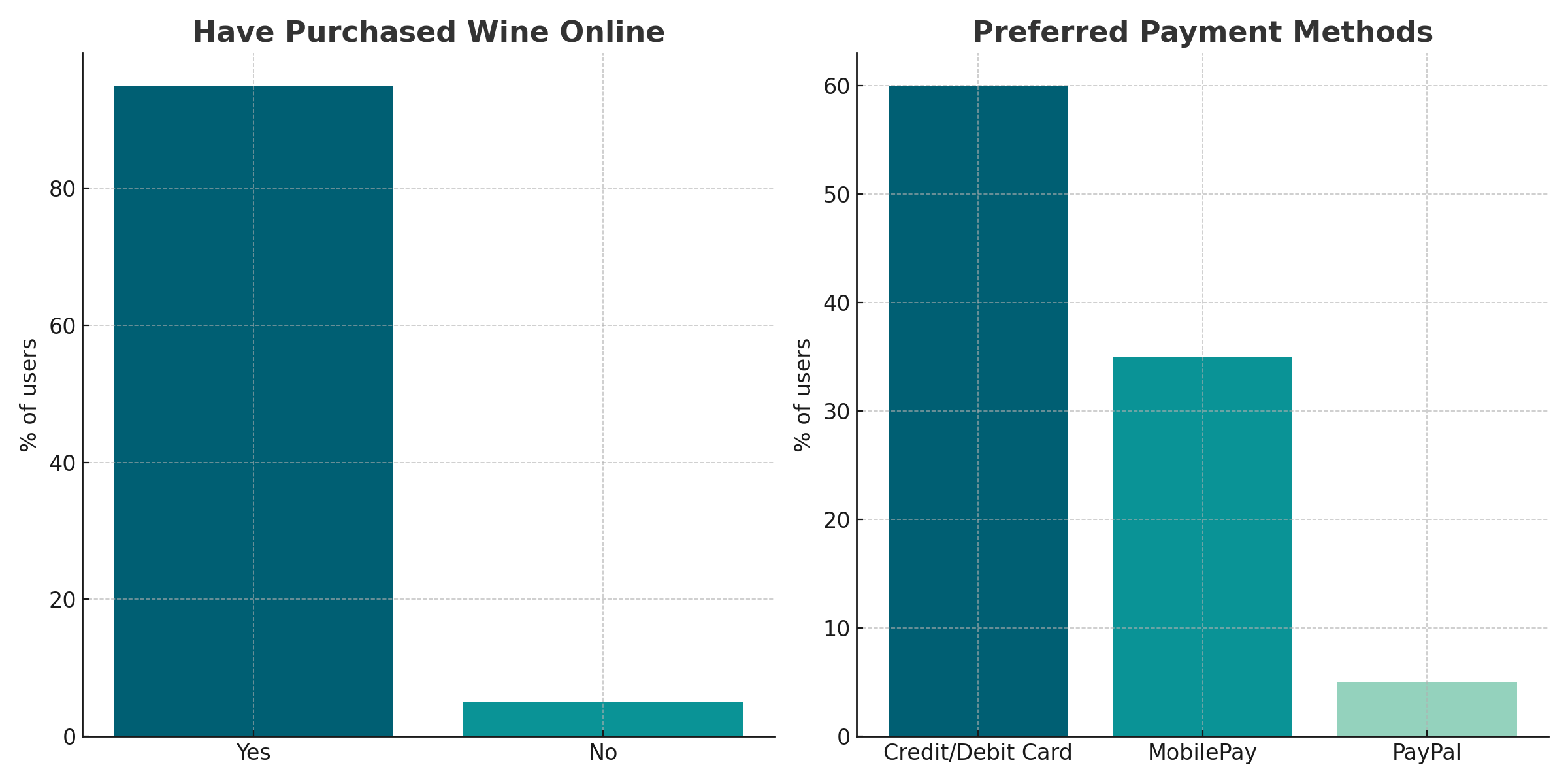
Extracted visual from the survey:
Wine shopping habits and preferred payment methods
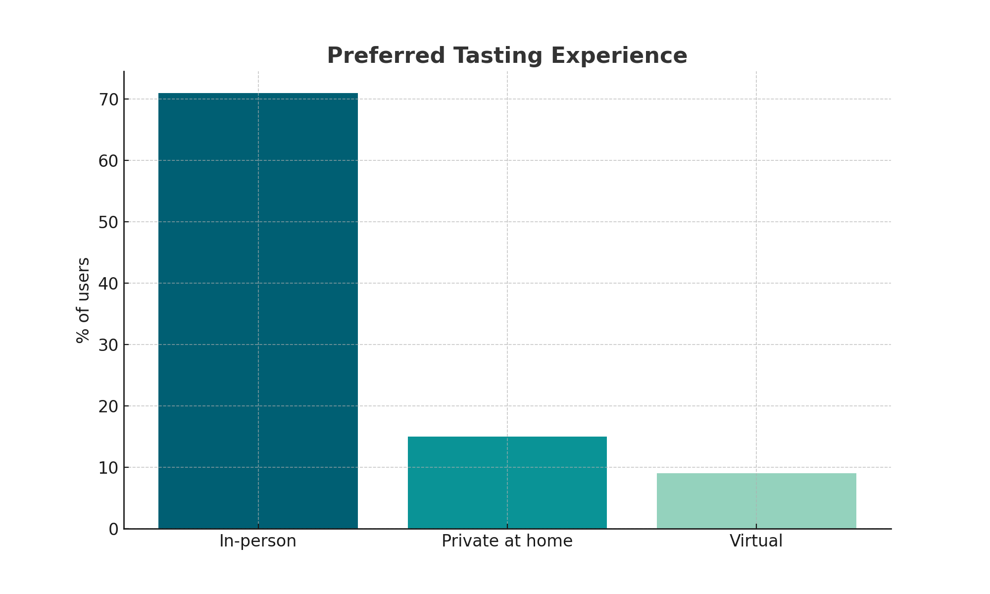
Extracted visual from the survey:
User preferences regarding wine tasting formats
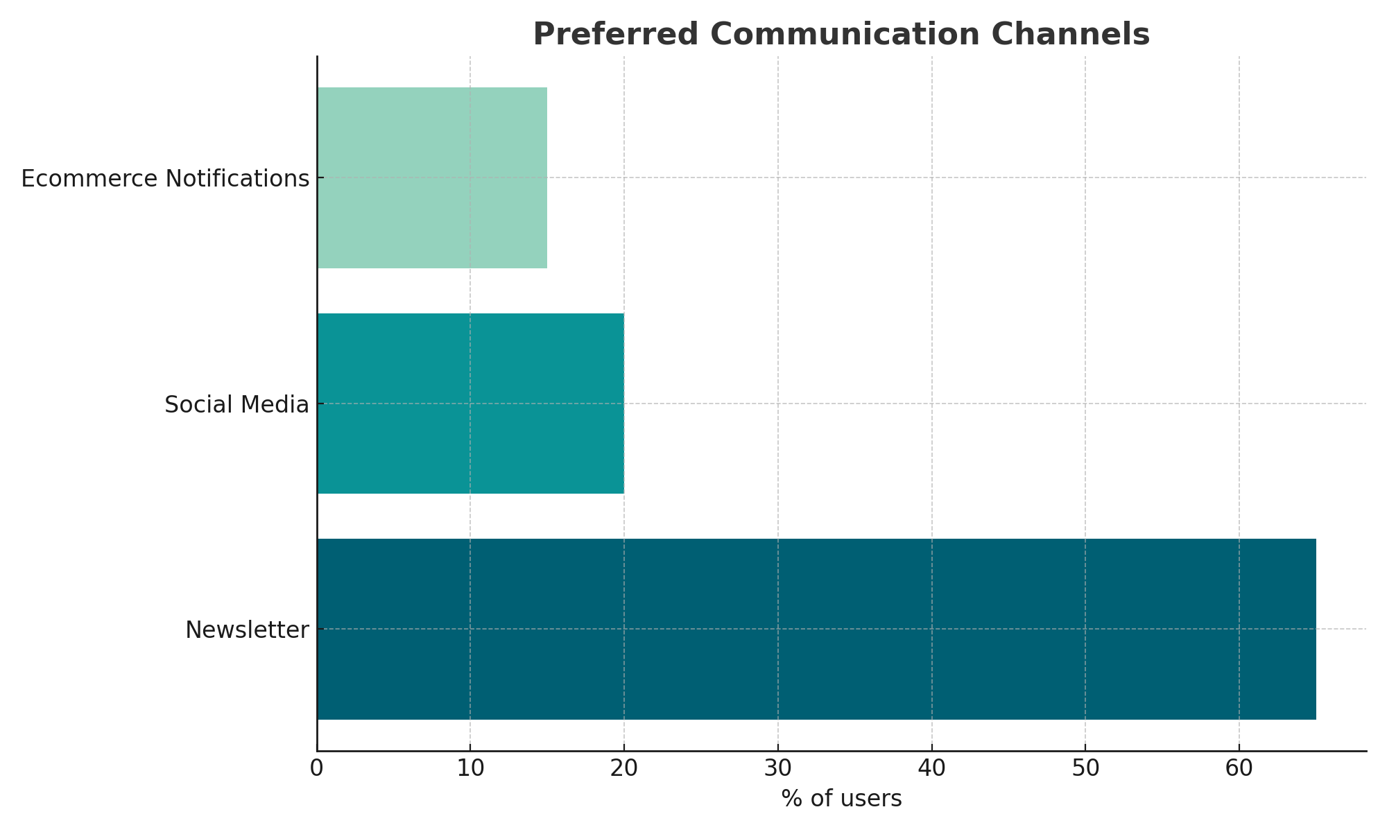
Extracted visual from the survey:
Preferred communication channels
Based on those, I created initial user personas and a user journey map, which I shared with the rest of the design team to align our efforts.


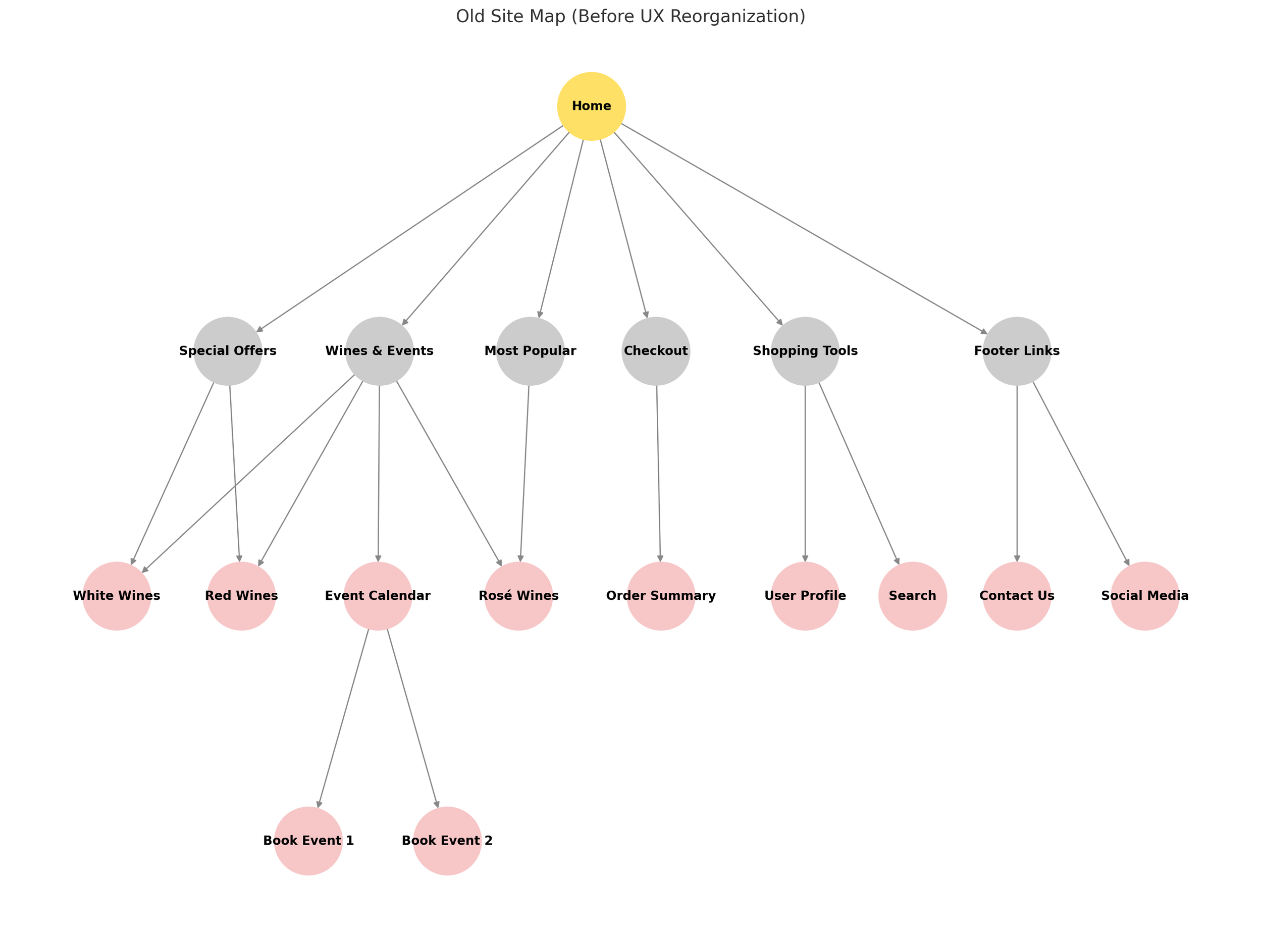
REDESIGNING THE SITE ARCHITECTURE
At the same time, I noticed that the internal structure of the e-commerce wasn’t working well.
Navigation was unclear, and categories were overlapping.
I redesigned the site architecture and presented a new layout that made the structure easier to follow for both users and the team.
Before:
Mixed categories (e.g. wines + events)
Duplicated items
Flat and unclear hierarchy
Utility features mixed with main content
After:
Clear content grouping
Logical, scalable structure
Redundancies removed
Better alignment with user expectations

PHASE 3 – Organizing the Chaos
As the project grew, it became clear that we needed more structure.
Designs were inconsistent, and collaboration was becoming confusing.
1) SPRINTS:
I proposed dividing the work into design sprints, assigning specific flows and tasks to each designer.
2) ORGANIZING FLOWS ON FIGMA:
On Figma, I also suggested organizing the frames by arranging the different user flows horizontally.
Instead of using a tree structure with branches, the flows are laid out side by side, visually representing the different logical steps a user can take.


Figma Preview
3) TRELLO:
I organized the team's workflow using Trello, distributing tasks among the designers and coordinating priorities with the developers.
Each day, I assigned tasks based on urgency:
from critical to lower-priority items.
And ensuring a clear progression across columns:
from 'Ideas' to 'To Do', 'In Progress', 'Ready to Review', and 'Done'.

This visual and structured approach allowed me to efficiently align design and development efforts while keeping everyone updated on the current priorities.
PHASE 4 – Iteration and Refinements
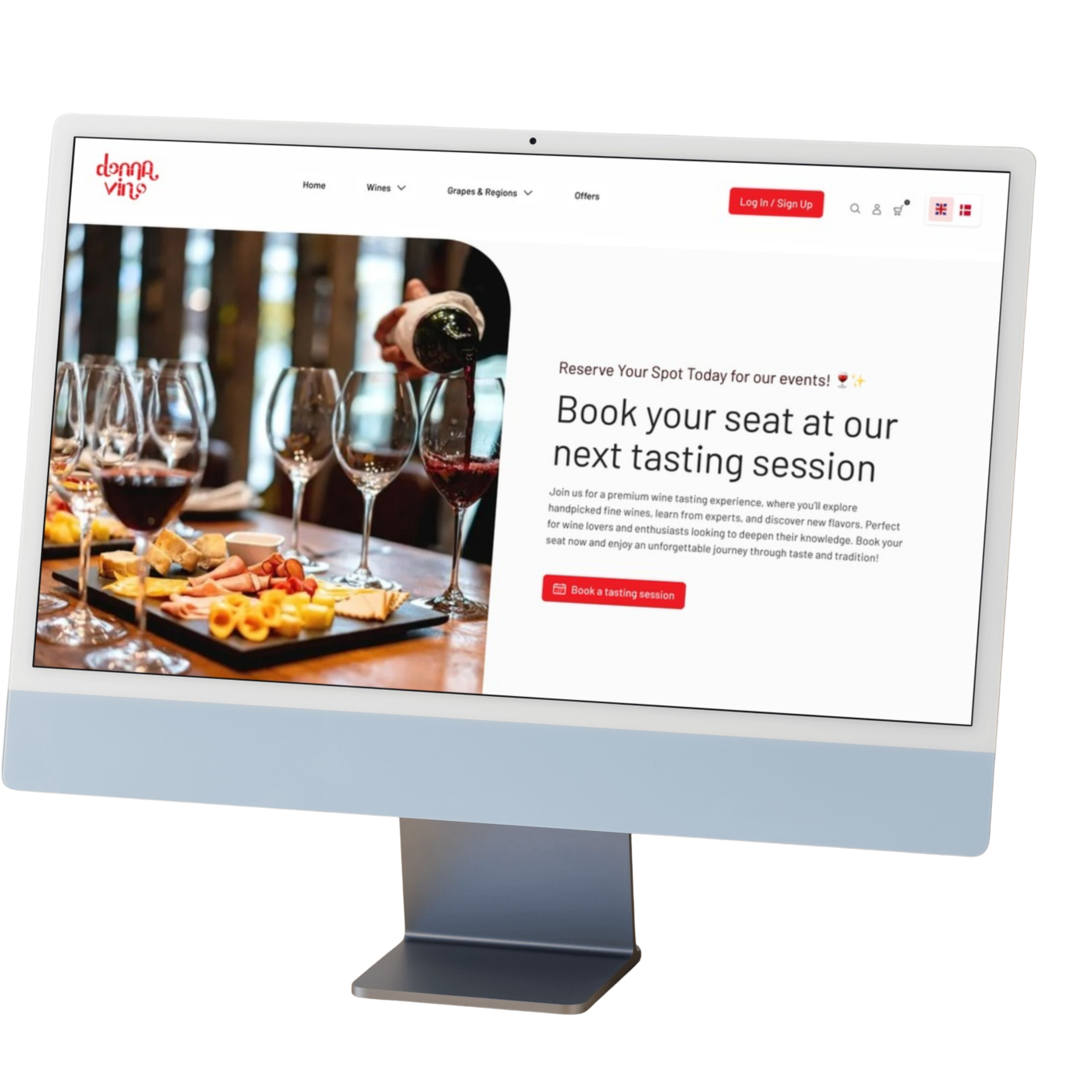
At the end of this phase, we launched the first version of the e-commerce platform.
Some advanced features were hidden for development reasons, but the MVP was ready and functional.

After the MVP was released, we started collecting user feedback.
This helped us identify some usability issues and areas that needed improvement.
Based on this feedback, I focused on optimizing specific parts of the experience.
PRODUCT SHEET:
1) Several users selected many bottles at once and asked about discounts for large orders.
I added a quicker selection option by introducing a 6-bottle case, displayed with a reduced price per bottle directly below the description.
2) Some users were frustrated to find out an item was out of stock only after adding it to the cart.
To solve this, I added a status indicator at the top of the page: green for 'In Stock' and red for 'Out of Stock'."


SEARCH BAR:
Based on usage data, we noticed that very few users were using the search bar to quickly find a product.
Upon further review, it became clear that the search bar lacked proper visual hierarchy and wasn’t engaging enough.
To improve this, I redesigned it by applying a new text hierarchy that gives more prominence to the suggestions displayed during user input.
I also used one of the brand’s theme colors to make the search bar stand out more and draw users’ attention
Web Layout


Mobile Layout
Web Layout

The search bar is now more visible
As soon as the user clicks on the search bar, quick suggestions appear, displayed with a more effective text hierarchy


When the user starts typing, a loading spinner is shown

If there are no matches, a message appears accordingly;

if there are matches, relevant results are displayed
REVIEWS SECTION:
In the reviews section, after discussing it with the team, I decided to require users to log in before posting a comment.
After noticing a few inappropriate messages, I introduced this restriction to better filter the discussions.
User logged out and logged in

User logged in
User logged out
WHAT I LEARNED
This journey at Donna Vino gave me the chance to grow really a lot as a designer:
I learned how to manage complexity, align a team around shared goals, and create a scalable design system from scratch.
Most importantly, I understood how to balance user needs, business priorities, and technical constraints especially when working in a fast-paced, remote environment.
The e-commerce platform we built is now live, and the design continues to evolve.

