Donna Vino
Turning an early-stage e-commerce concept into a structured and scalable product
Research Led Design · Experience Architecture · Product Strategy
2025 · 7 months
Project Overview
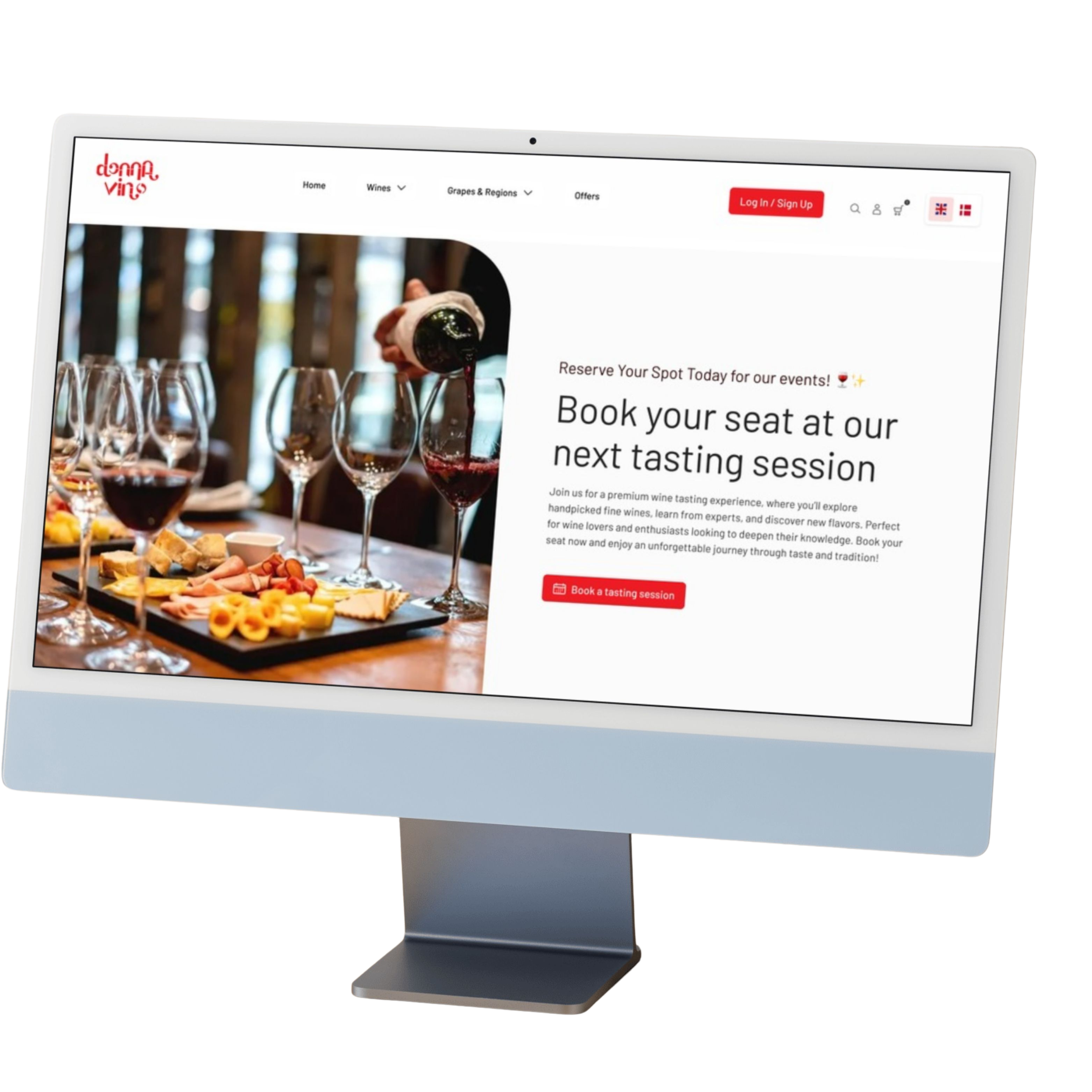
Donna Vino had an active customer base, but the platform lacked a clear and scalable structure to manage both product sales and event bookings.
When I joined the project, the product was still in an early stage. Only a few pages had been designed, and many decisions around structure and navigation were still open.
My role
My role was to help define a solid UX foundation, bringing clarity to the experience and supporting the product as it evolved.

I worked across research, information architecture and UI design, translating user needs into clear flows and a more structured system. I also supported the team in making consistent design decisions throughout the process.
This allowed the product to grow in a more structured way, keeping design, business needs and development aligned.
Research goals & Setup
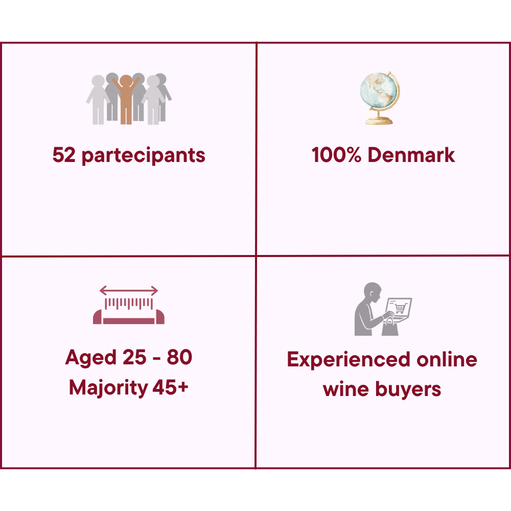
First step: Conduct our first UX Research
We chose to proceed with an online survey with Donna Vino’s existing customers: people who already knew the brand through in-person wine events.
The main goal of the research was to understand:
how users discover and choose wines online (whether they already used wine e-commerce platforms)
what information they rely on when making a purchase
which parts of the experience create uncertainty or friction
Although this method gave us mostly quantitative feedback, it allowed us to quickly collect structured insights and identify recurring user needs and pain points.
Research focus
Online wine purchasing habits
How users choose wine online
Information needed before buying
Pain points in existing wine e-commerce experiences
Interest in booking tastings and events online
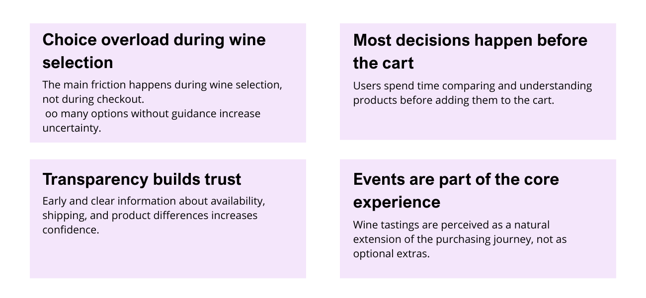
Key Research Insights
Stakeholder Alignment
In parallel with user research, it was necessary to create alignment within the team, as there was no clear product direction.
To address this, I organized a 4-days stakeholder workshop to gather input, clarify priorities, and support decision-making.
Day 1 : Problem framing
→ Structured fragmented input into clear problem areas
Day 2 : Product definition
→ Defined how events and e-commerce should work together
Day 3 : Prioritization
→ Aligned on features, scope, and development phases
Day 4 : Execution alignment
→ Defined roles, workflows, and direction for delivery
From insights to product decision
By combining user research and stakeholder input, we translated fragmented information into clear product decisions.
→ Guidance over quantity
Structured navigation and product grouping
→ Focus on decision-making
Design supporting user choice, not just browsing
→ Events as core experience
Integrated booking within the main journey
→ Scalable structure
Defined a clear information architecture
Informational Architecture
Initial State
The initial structure made it difficult to understand and scale the platform.
Key Issues:
Events and products were mixed
No clear category hierarchy
Overlapping and duplicated content
Navigation lacked consistency

Redesign
I restructured the platform to create a clear and scalable system supporting both events and e-commerce.
Key improvements:
Clear separation between events and products
Logical and scalable structure
Reduced redundancy
Navigation aligned with user expectations
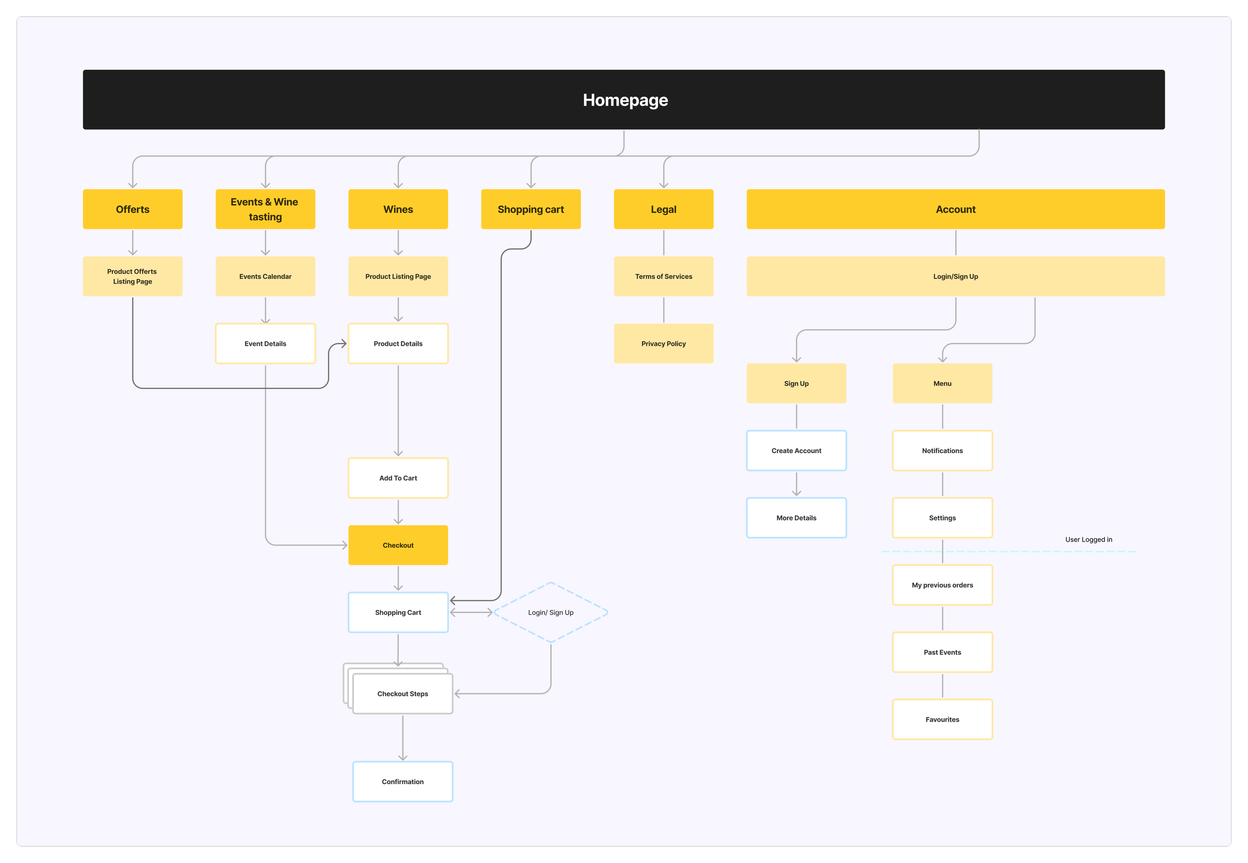
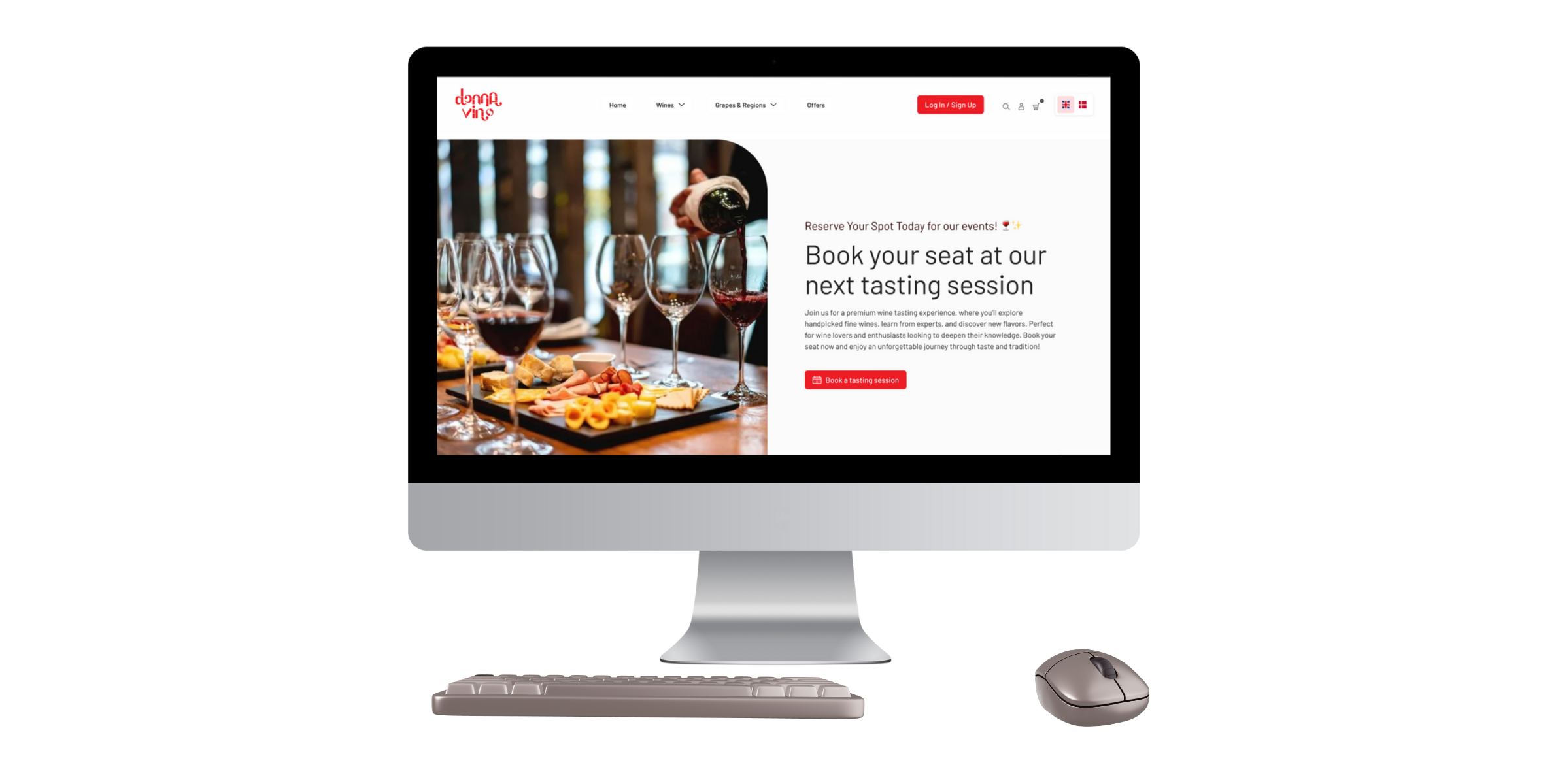
Product Experience
The platform was designed around two core user journeys:
Attending events and Selecting wines.
EVENT BOOKING FLOW
Browse available events
Access detailed event information
Book independently online
PRODUCT FLOW
Navigate structured categories
Compare products
Make informed decisions


Design Execution
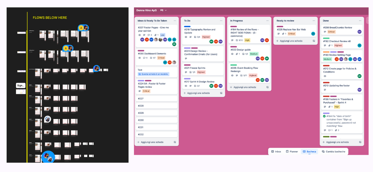
To support the growing complexity of the project, I structured design workflows and team collaboration.
Key contributions:
Organized design files in Figma for clarity and scalability
Introduced sprint-based collaboration
Coordinated design and development work
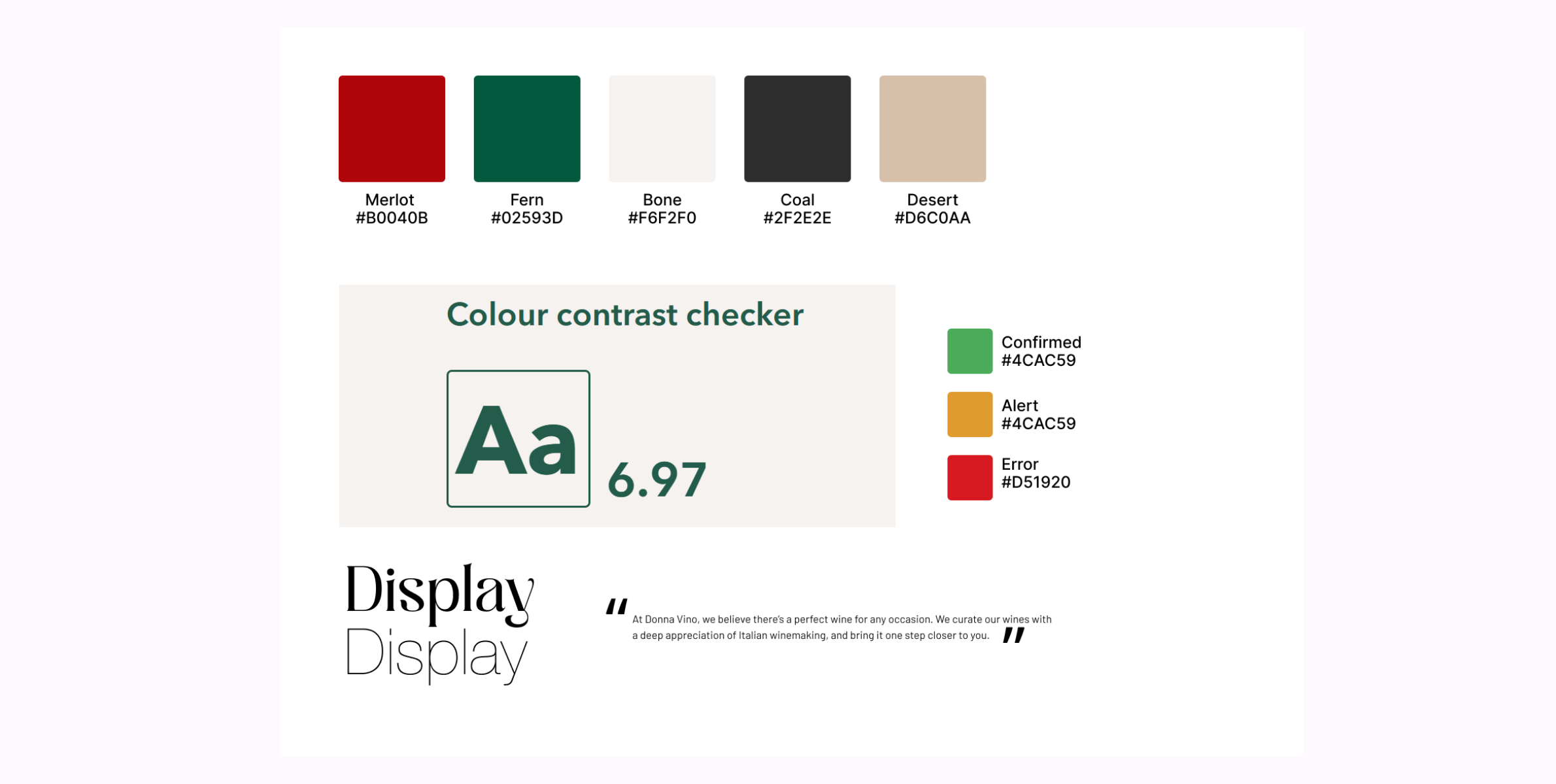
Design System
The design system supports a scalable product structure, ensuring consistency across both e-commerce and event experiences.
✔ Reusable components
✔ Clear hierarchy
✔ Consistent interaction patterns

Outcome
PRODUCT IMPACT
The platform introduced a structured and scalable foundation for both event management and e-commerce experiences.
✔ Enabled independent event booking
✔ Supported product discovery and decision-making
✔ Created a clear and navigable structure
USER IMPACT
Users can now interact with the platform in a more intuitive and guided way.
✔ Easier navigation across different sections
✔ Improved clarity in product and event selection
✔ More confident decision-making
TEAM / PROCESS IMPACT
The project also improved internal collaboration and alignment.
✔ Clearer communication with stakeholders
✔ Structured design workflows
✔ Better coordination between design and development
Want to work together?
Get in touch!